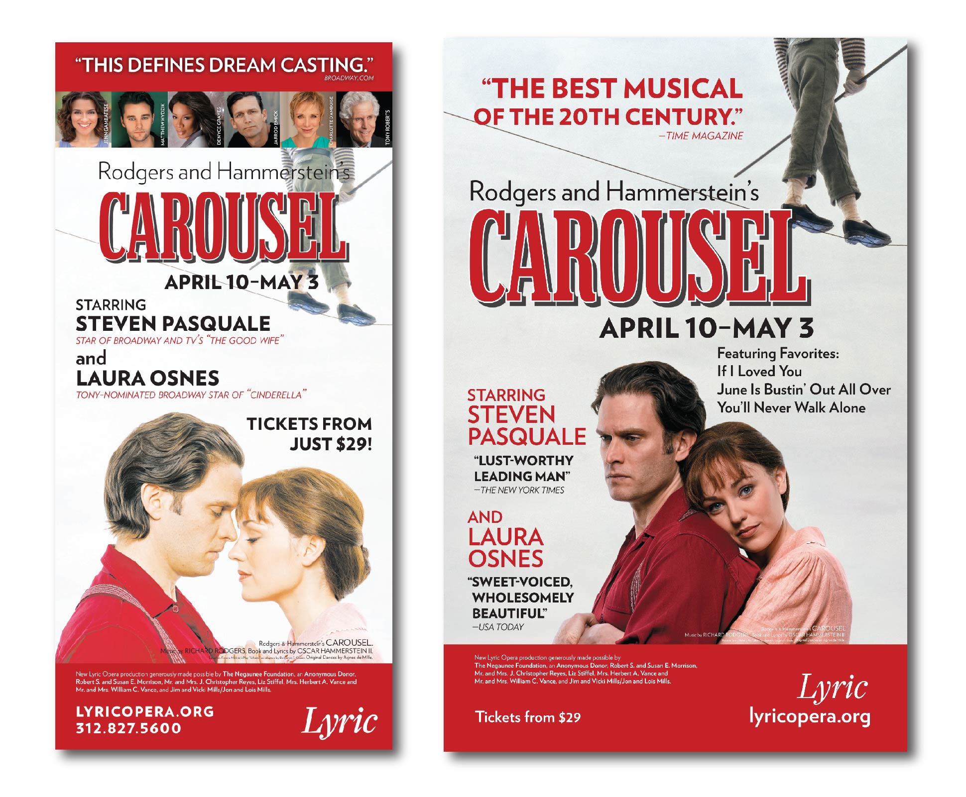
These were just two of many ads, from magazine to billboard, created for Lyric Opera's production of Carousel.


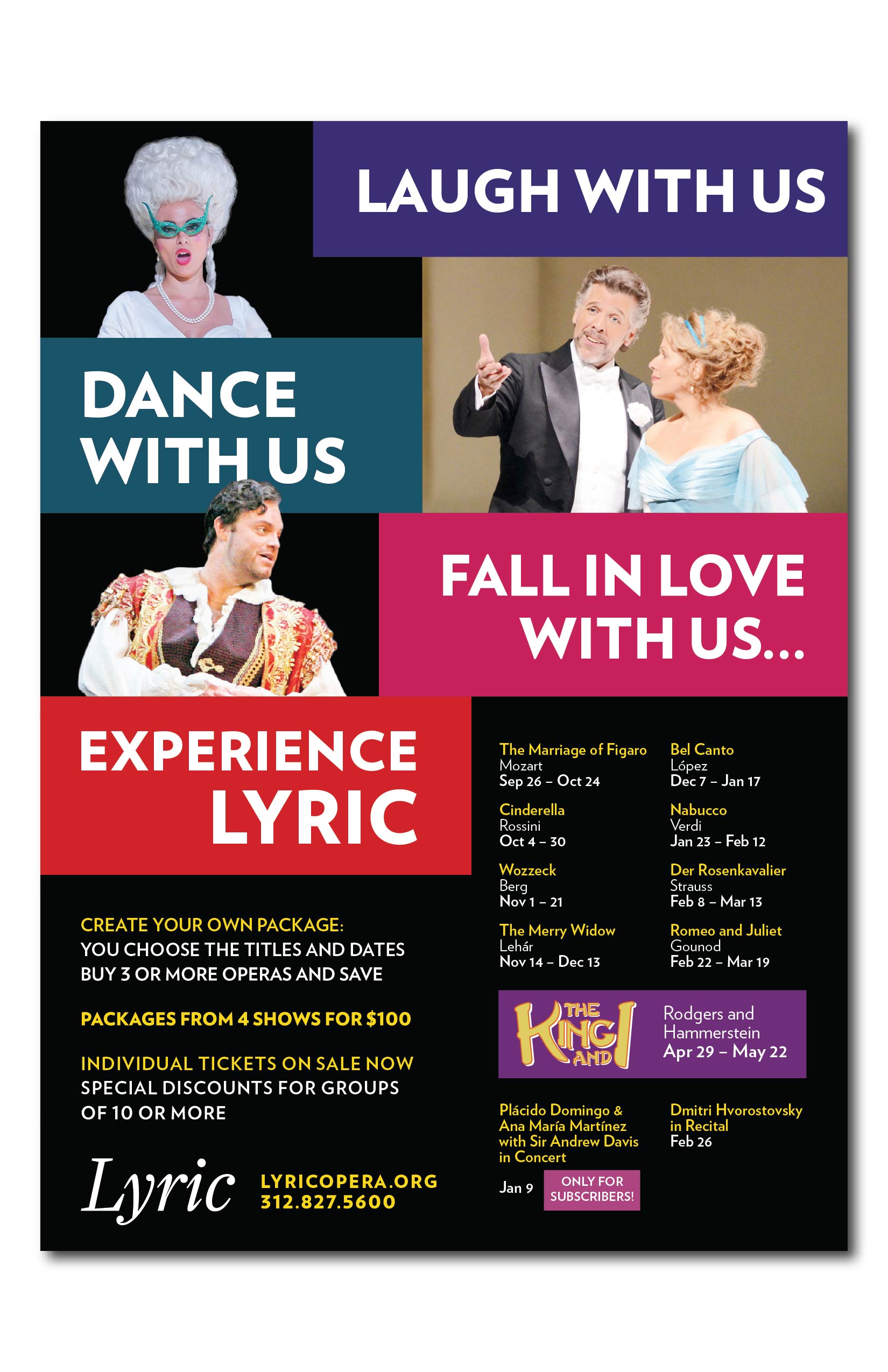
2-sided folded mailer advertising Lyric Opera's production of Bel Canto.
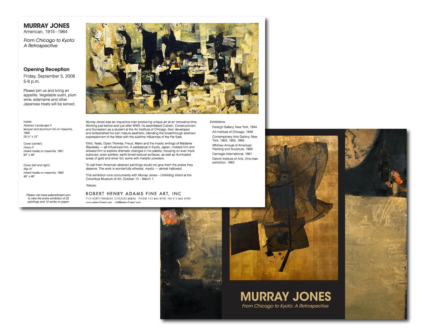
Gatefold mailer for Robert Henry Adams Fine Art
The Read/Write Library, a Chicago-based nonprofit, needed a logo for the launch of their new book club subscription and I was happy to oblige. It is designed to work with a variety of 2-color combinations that can change based on each month's publication.
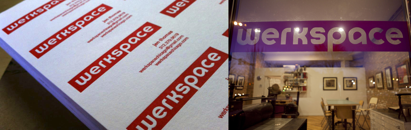
werkspace, a community-focused gallery and arts space, needed an identity that would represent the scope of its mission. With the interdisciplinary work of the Bauhaus in mind, I chose Herbert Bayer's typeface Universal for the logo and created letterpress-printed business cards and corresponding vinyl signage for the exterior windows and door.


John is the guy who makes sure that stages, pyrotechnics, props, equipment, and just about anything else an event needs makes it from one location to another. He wanted a logo that let his clients know he's a Chicago-based business, but that he can tackle a variety of event needs anywhere in the US. I used event posters from the late 1800s for layout and typeface inspiration, inserting a nod to the Chicago flag with the blue border and 6-pointed stars. My biggest challenge was trying to incorporate a variety of fonts into one logo. With some customization of existing fonts, I think it was pretty successful. Thankfully, John did, too.
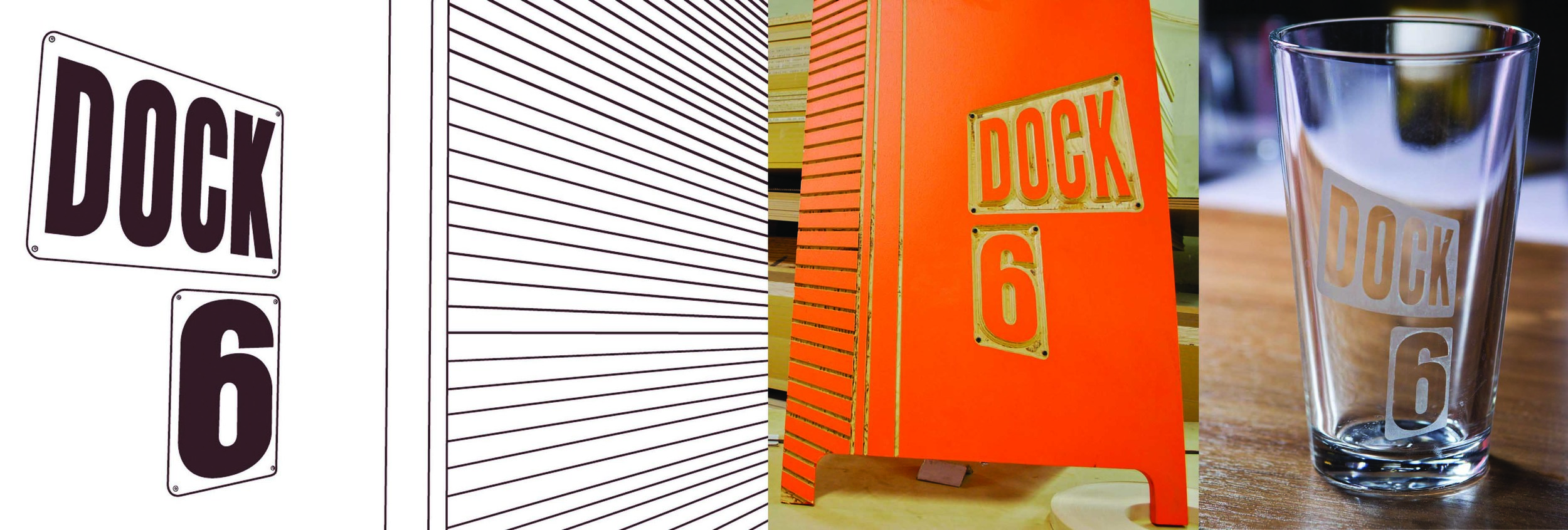
Dock 6 is a furniture collective based in a large warehouse in Chicago's Hermosa neighborhood. The uniqueness of the building structure and signage were the inspiration for their identity system. Their logo is easily translated to 3D signage, marketing materials, website, and business cards.
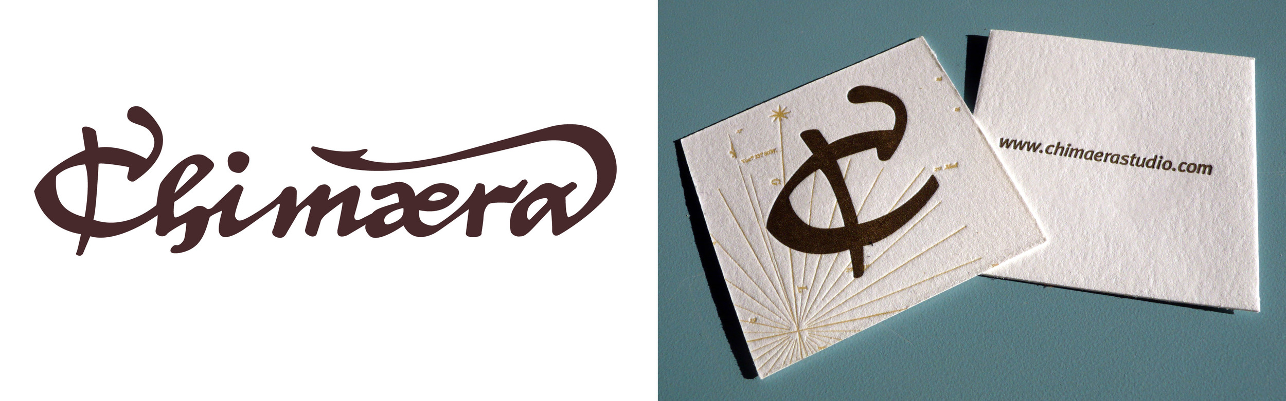
Chimaera is a high-end custom furniture company that creates pieces utilizing gorgeous walnut paired with hand-tooled leather fronts that are often gold leafed. The imagery on Chimaera's pieces are typically inspired by Italian maps from the 14th and 15th centuries, so I worked with the client to incorporate this focus into their identity. The typeface is hand drawn and paired with Italian map imagery, then letterpress printed in deep chocolate brown and gold on Crane's Lettra paper.
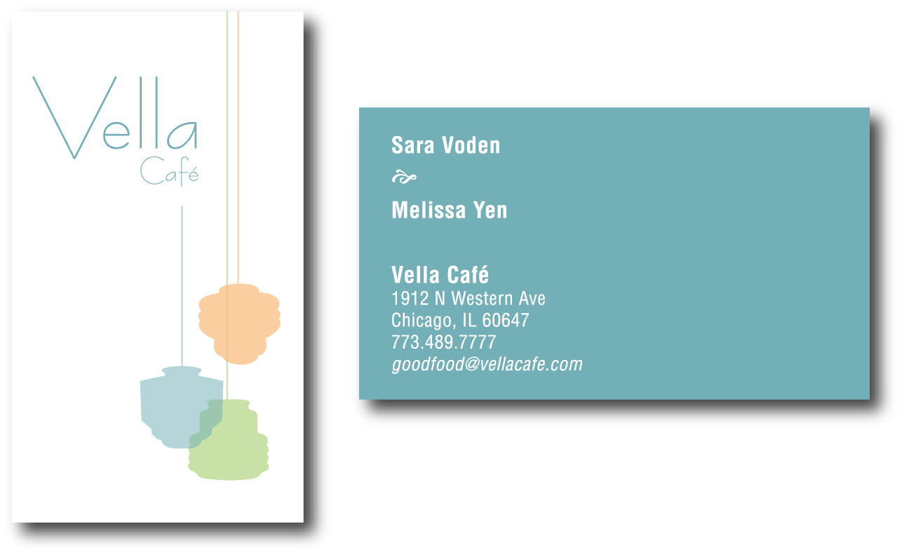
Vella ultimately chose a different concept for their signage and identity system, but this was by far my personal favorite. The restaurant was filled with vintage pendant lights, so I used those as a graphic element on the front of the card.
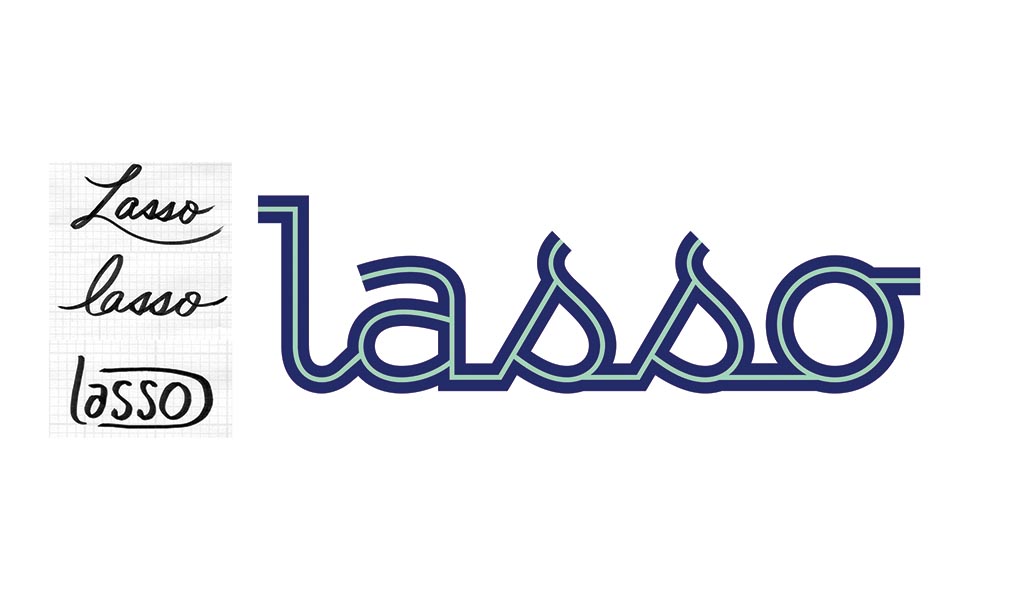
Lasso works with a variety of clients to customize software for customer management. Lasso's Principal wanted a logo that would be approachable and slightly feminine, yet also speak to Lasso's deep software focus. As you can see from the original sketches, we ultimately decided that a more structured script was the way to go. It is still feminine, yet modern, and emulates circuitry with the inline color difference.

I created a variety of banners for use in Smart's email communication, websites, brochures, ads, and other print applications.
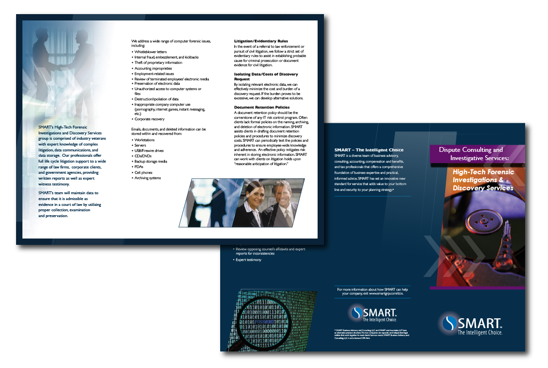
One of many trifold brochures created for each practice area.
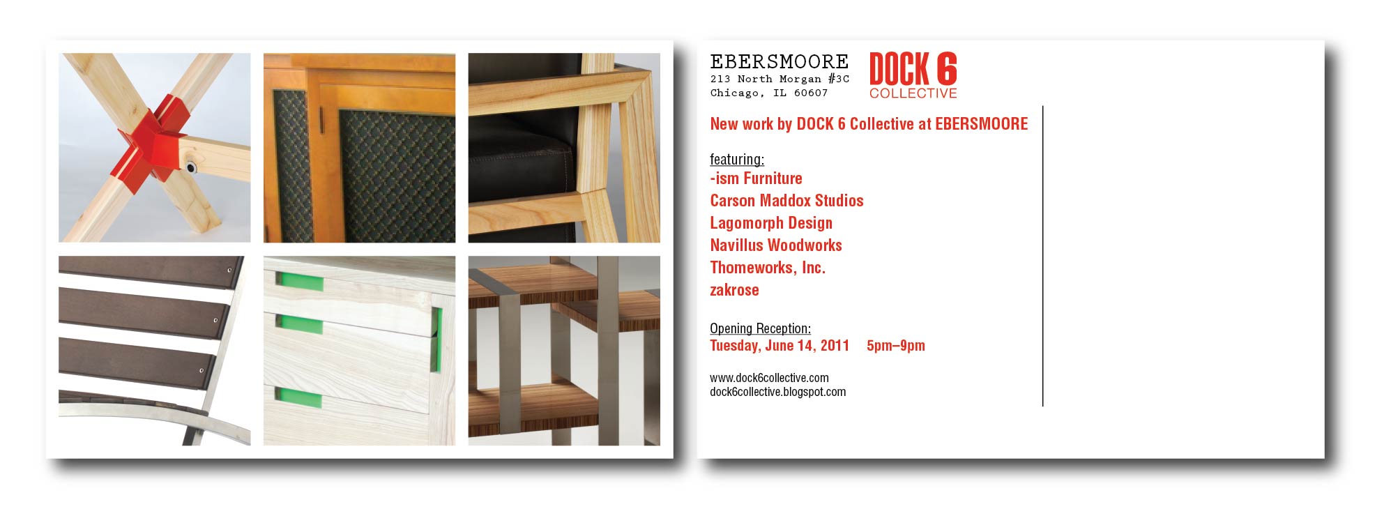
Postcard mailer for one of many Dock 6 Art + Design events.
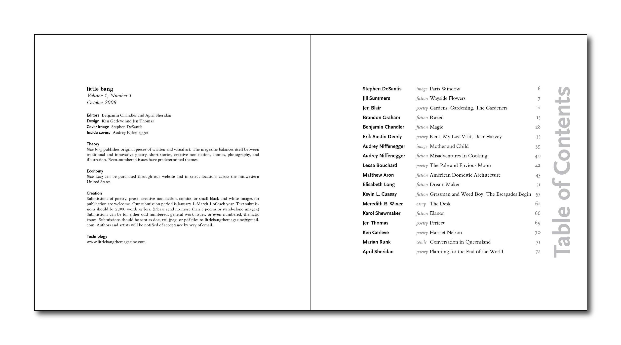
Little Bang is a literary journal produced by a group of writers working together in Chicago. It was digitally printed in an open edition.
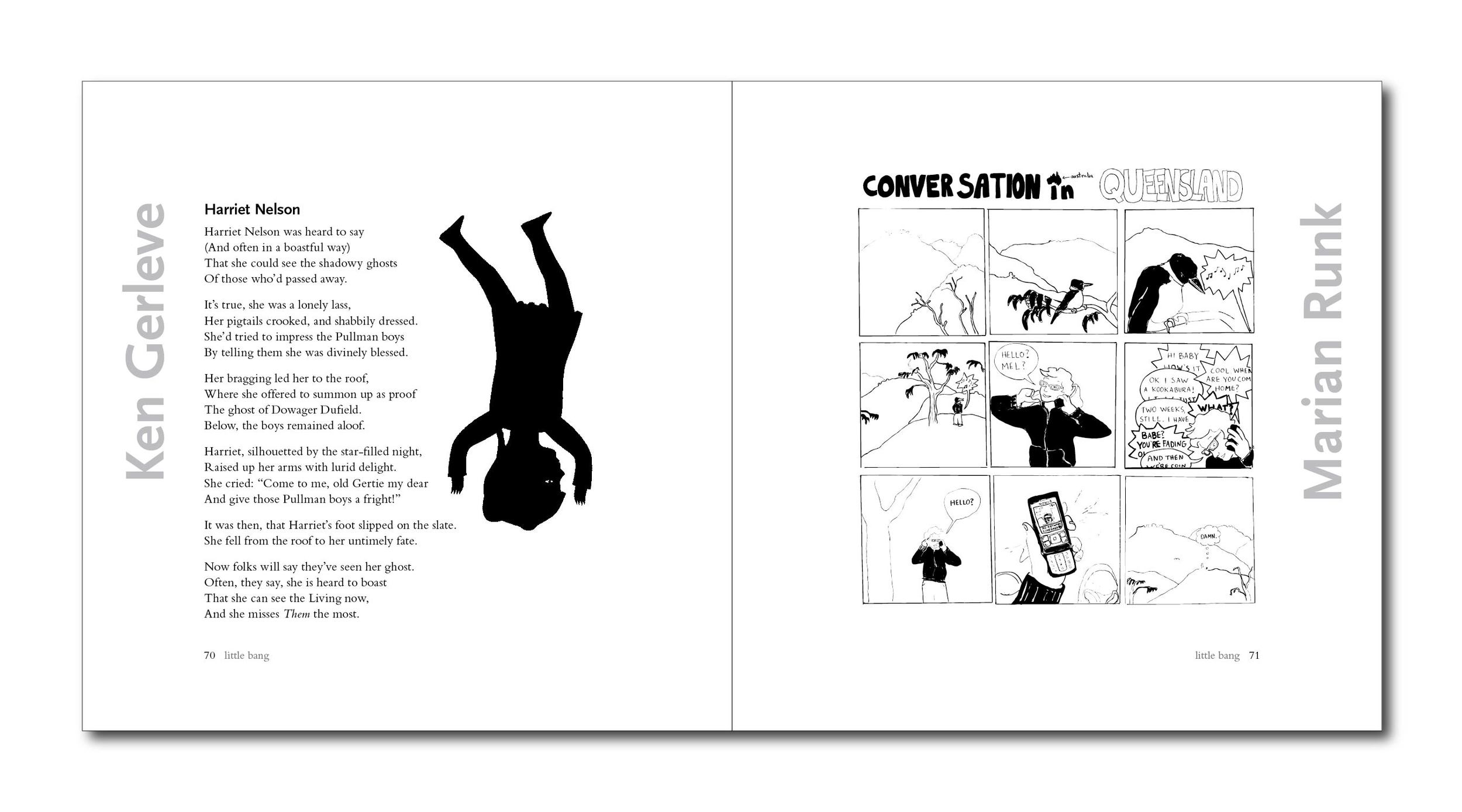
Little Bang is a literary journal produced by a group of writers working together in Chicago. It was digitally printed in an open edition.
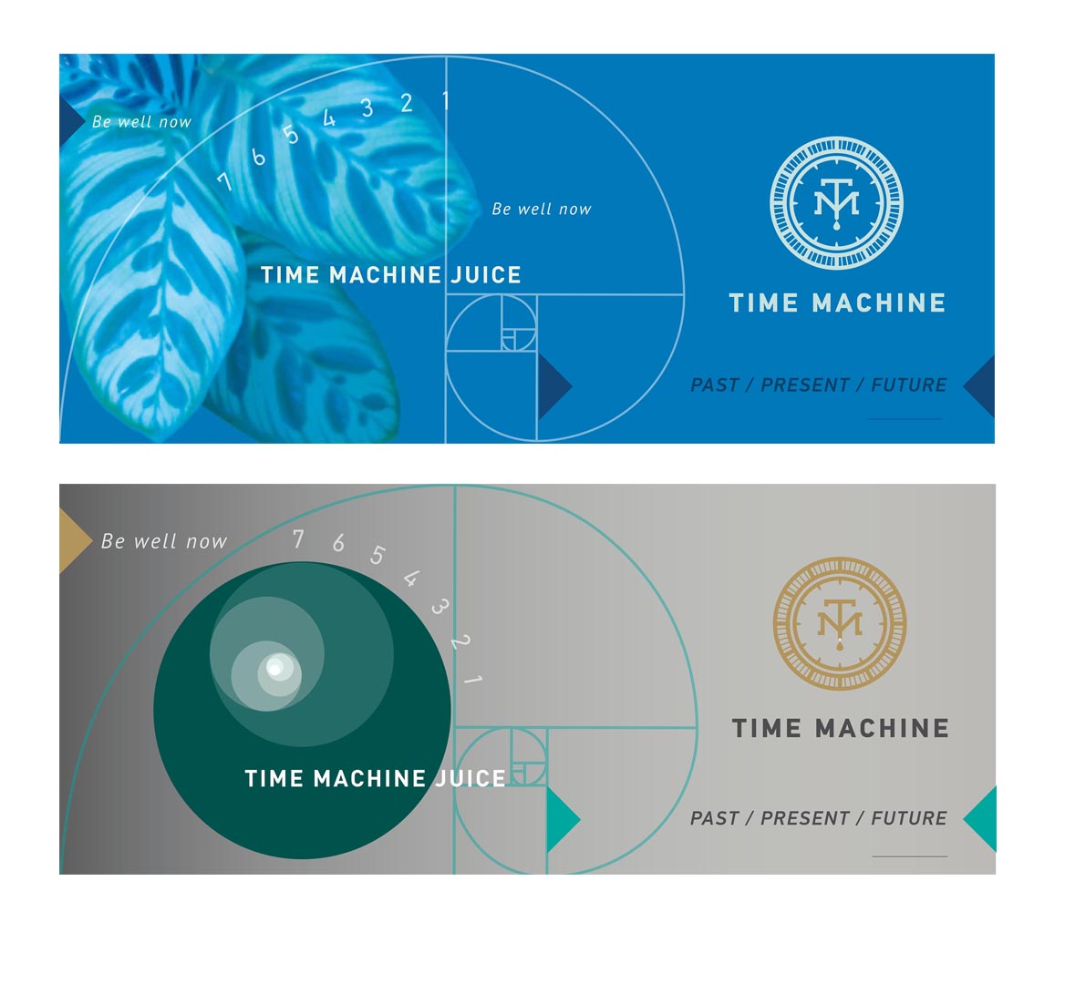
These were 2 package concepts for Time Machine Juice's Cleanse Cases—boxes containing 6 juice bottles each. The concept focused on the golden ratio, as it is found prominently in nature.